Website Makeover

We’re proud to announce a newly completed website makeover for Financial Wellness Tower. The old site was created by a tech guy who understood function but had little understanding of design. He installed several proprietary coding that was hard to update and even fix.

THE OLD SITE


The client was frustrated because requested changes were not being done. Functions were not working and the programmer was unresponsive for days.  The transition was difficult because the programmer was hard to get in touch with. And when he did communicate it was hard for him to explain what was going on.  He really tried his best (and we thank him for that) but it clearly was not working.

We decided to revamp the site from scratch. To comb through the coding would have taken so much more time and we believed they were defective to begin with.

The client was highly creative … an idea person. She was as expert of her industry but not a detailed person. We understood that and we would bounce ideas around to make sure we understood her concept.

THE NEW WEBSITE

This is what we did:

  • We registered a new domain, one that was shorter and easier to remember.
  • Determined what theme and plugins we needed.
  • She gave us the raw text and we edited and laid them out with appropriate pictures.
  • We translated them into Spanish and Chinese.
  • Wrote some special programming when popular templates couldn’t do the job.
  • Created call-to-action opportunities  with forms and banner ads.
  • Modified the illustrations.
  • Created a new logo to help branding.
  • Improved the download time.
  • Improved the navigation.
  • Uploaded the video lessons.
  • Set up a payment system.
  • Created a Forum.

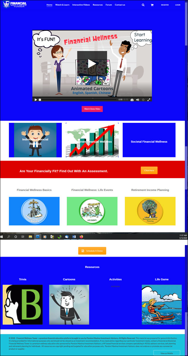
Here is what the new website looks like:

The client is happy. She has gotten a lot of positive feedback. We are happy because we made her dream come true. Do go and visit the Financial Wellness Tower. This is a fun website that teaches you to become a smart spender/saver through animated video lessons. It has quizes, workbooks and transcripts.

Get in touch with us if you’re a dreamer. We make dreams come true.
Making Signage for the La Habra Art Walk

“Can you make 2 signs for the La Habra Art Walk? We’ll buy all the materials so we can go with you to the hardware store … and by the way, we need it tomorrow.”

That was how we started this project. Immediately, concepts were floating in my mind:

“What if, instead of a regular sign pointing the way to the Art Walk … what if I recreate a famous painting and have whoever is in that painting pointing to the Art Walk?”

We were walking around the aisles of the hardware store and we were looking at different boards and selecting the paints, and the whole time I’m thinking that I will have to drop everything and work on this tonight. Will I have time? After all, the wooden panels we bought were huge — 4 feet square. Will I have all the materials I need? No more time for buying more supplies.

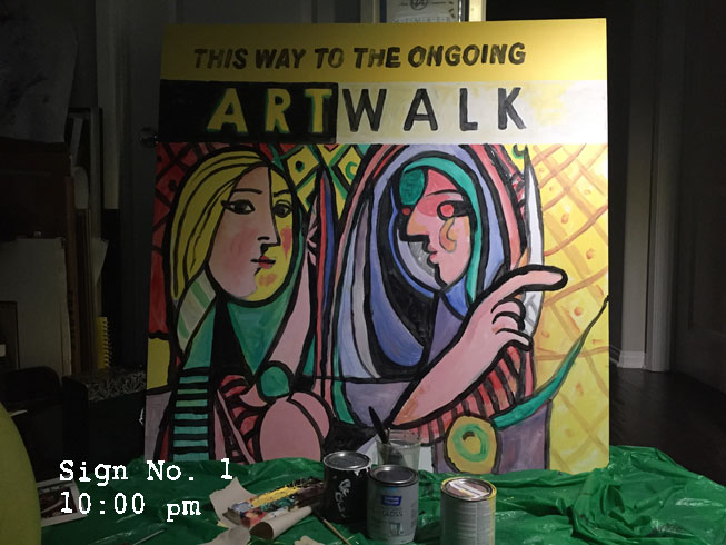
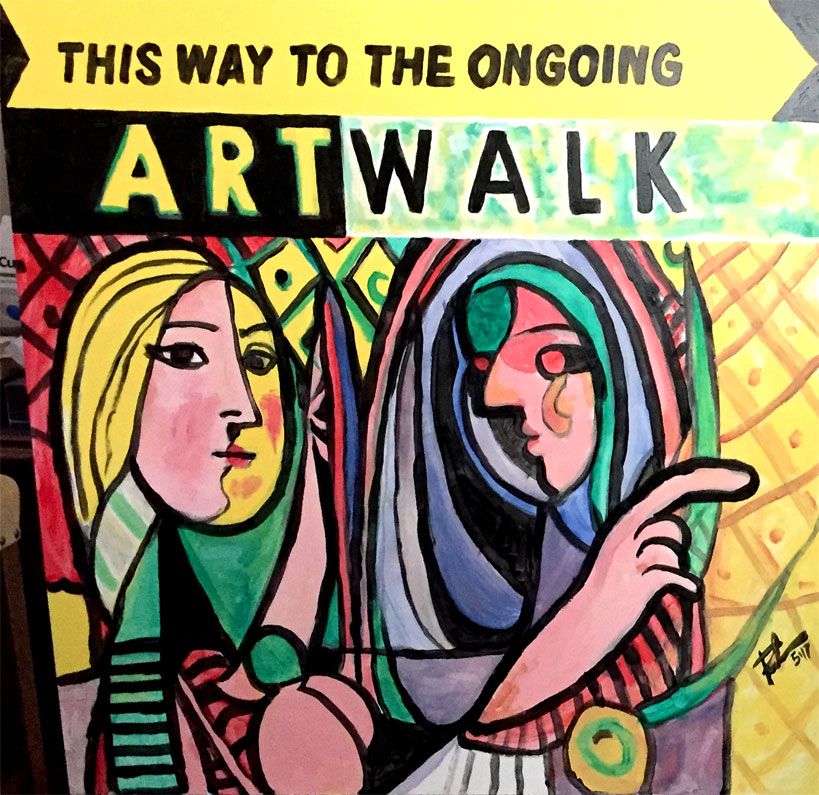
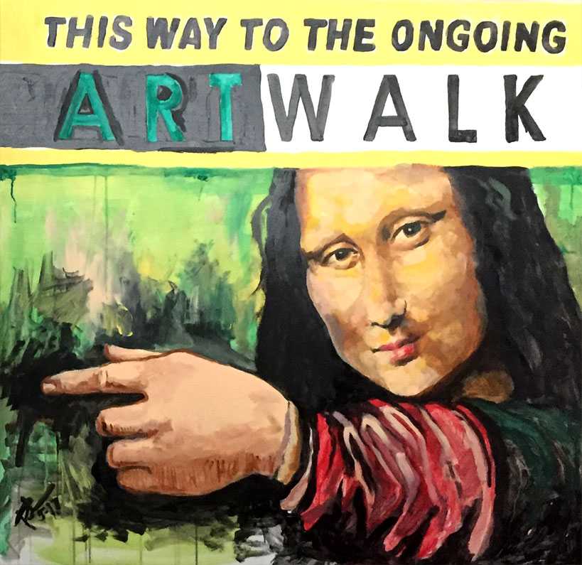
I decided to do a famous abstract painting and a famous classical painting. I chose Picasso’s “Girl Before a Mirror” and Leonardo’s “Mona Lisa.”

I did a little research for the original pictures then — paint rollers came off the shelf, painting tarp was spread on the floor, my box of acrylic paints were laid out, I set music to play in the background then I started splish-splashing away! 5 hours later, I came up with this:

picasso-working

It was late at night and I went to bed wondering if I would have time to make the Mona Lisa. I dreamed about what I was going to do in the morning.

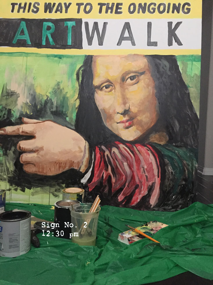
The sun was just about to show itself and I proceeded to do Leonardo’s masterpiece. Do I do it cartoon style or do I do it realistically? I knew I didn’t have enough time because not only did I have to make the sketches, the text, then, after all of the painting, I would still need to let it dry. Cartoon style is easy. Classical style is difficult.

I pondered and said, I’d do it the hard way. I liked the challenge.  Splish splash I was at it again. 4 hours later, it was done. Behold my Mona Lisa!

mona-working

I know her face looks kinda weird. But hey, I was running out of time and  I think people will get the idea.

My good deed was done. People loved it.

“That’s amazing Raoul!” said Michelle.

“Dude, that’s freakin’ awesome!” said Miguel.

“That looks great Raoul!” said Anna.

My good deed was done. End of story.


The final look:

picasso-point

Mona-point

Fence Art in La Habra

WYNK Marketing is making plans for a “Love La Habra” event. On April 29, 2017 hundreds of volunteers will be scattered around the neighborhood to show unity and love.  Pre-selected areas will be cleaned up and beautified.

Print

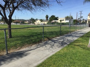
WYNK is part of the board of the La Habra Art Walk and we wondered what we could do to help the Washington Middle School. What can the Art Walk do that will 1) promote art, 2) engage the community and 3) help the school? Do we paint the walls? Do a mural? Do we paint signs? WYNK came up with Fence Art. WYNK will design the artwork and groups of children/volunteers will be assigned sections of the fence.

fence1

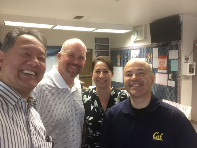
With the help and encouragement of Michelle Bernier and the Art Walk board WYNK consulted with Principal Mario Carlos who said the neighborhood (which is mostly Hispanic) is nervous about the INS (Immigration and Naturalization System) and are afraid to join public gatherings. He wants the community to feel safe and have a purpose. Carlos said he wants the kids to look forward to college.

PricipalCarlos

Raoul Pascual, Jeff Bernier, Michelle Bernier and Principal Mario Carlos.

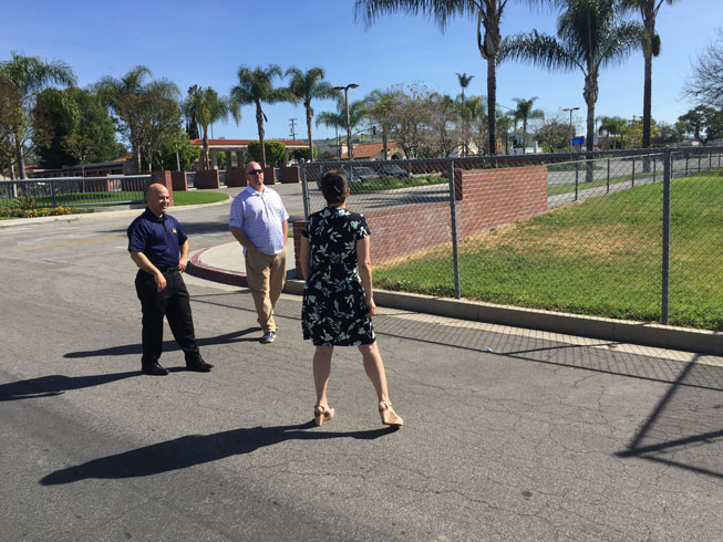
checkingoutFence

WYNK developed a concept of putting colored cups on the perimeter fence. (We’ve seen it in some fences but we have never really done this but in theory, the plan should work.) Originally, the concept was to design a fence with children running and even having an animation that can be seen at night. After some preliminary calculations we decided it would be too ambitious for the first attempt.

compositerun

Then we thought of a train with a long caboose with the name of the school.

train

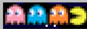
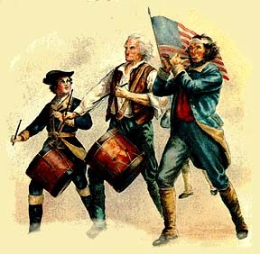
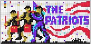
But after the talk with Principal Carlos we learned that their mascot was “The Patriots.” So we adjusted our idea to have the famous painting of the marching patriots translated into “pixels” — where one slot of the fence equals one pixel.

pacman

Patriots-marching

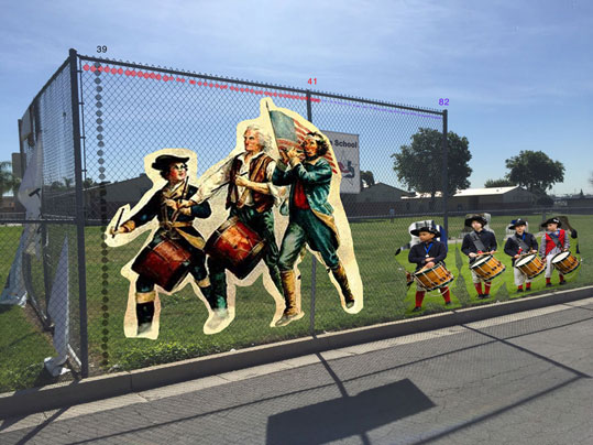
Here is the concept:

drumConcept

collegeSoldiers

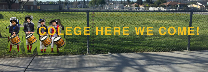
Here is the projected pixel artwork.

drum_Grid

infantry-pixels

collegeherewecome

It took several hours of experimentation but we believe we’re ready for March 29.  If you’re in the area and free, come and join us. It should be quite an experiment.

Chalk Art for the City of La Habra

La Habra held its first ever Art Walk on July 18, 2015. As usual I opened my big mouth and volunteered to help. I said I had never made one of those 3D Chalk Drawings that you see in the internet but if they were interested, I could probably create one. David DeLeon of Community Planning was delighted. In my mind I started calculating the work preparation — the designing, the measuring, the execution and  realized this was going to take at least half a day. So I tried to back pedal and reiterated that I had never done that before. But it was obvious David was already sold to the idea. My goose was cooked.

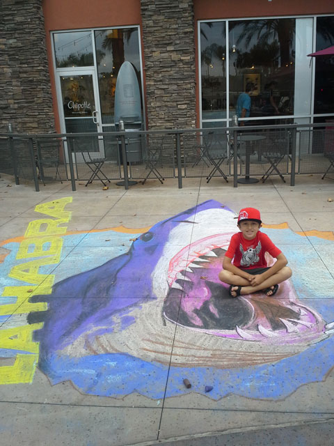
As the day approached I thought it was going to be cancelled because I had not heard anything more about it. Then Michelle Bernier of the La Habra Business Connection called about a week before D-Day and asked me what materials I needed. Never having done this before I said “colored chalk — lots of it.” And that was it. I hurriedly designed a great white shark coming out of a crack in the pavement. I coordinated with Luz Sparks of La Habra Art Gallery and she met with me Friday afternoon and checked out the site. After deciding where the shadows were going to fall at the time of the event, I started measuring the pavement and made the initial outlines. The sun was shining in full glory so I figured I was going to get burned doing this the next day.

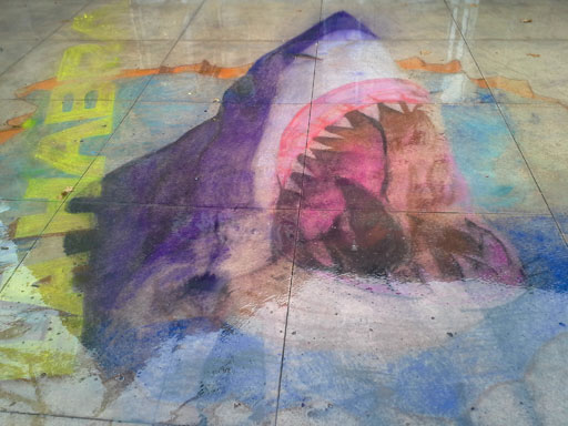
Saturday morning, the day of the event, I started the work. Curious passersby looked at it approvingly. I felt I was on the right track. Looking at the limited colors available, I had to adjust to what was in the original design.  Anyway, about 3 hours into the drawing, I saw tiny raindrops splatter on the design. I looked up and saw ominous clouds laughing at me — daring me to continue. I’m an optimist (a stupid one at that) and continued — “surely Mother Nature wouldn’t ruin the fun for all the kids and families, right?” Well, I was wrong. Within a few minutes it started to pour … and pour … and pour.

Here is what I did before the rain:

Jaws in La Habra
Jaws in La Habra


And here is what happened during the rain.

Washed away

Washed away


Oh well, at least one kid was able to take a souvenir of the very first Art Walk in La Habra — that never was.

If you want to read more about this, I posted this on 2 websites:

Corporate Branding for CAS

Corporate Branding begins with a lot of listening. It is understanding the client’s service, its goals, its personality and balancing all of these ideas with the budget at hand. WYNK’s favorite clients are non-profit organizations because they are all about making the world a better place.

ned

Convalescent Aid Society Logo

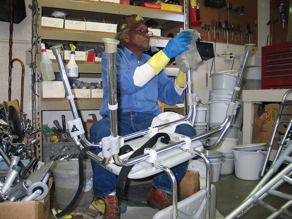
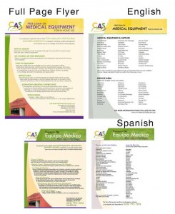
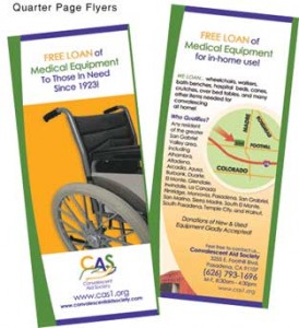
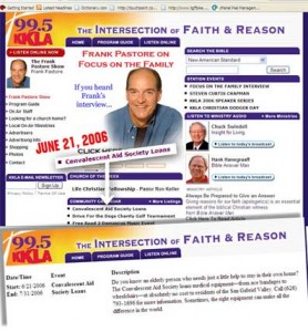
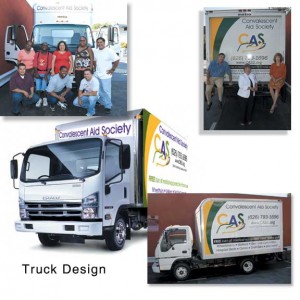
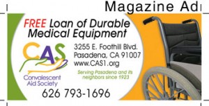
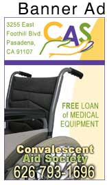
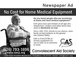
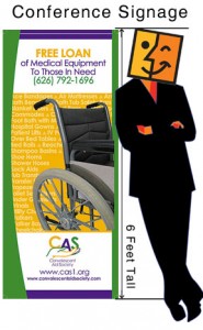
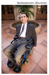
The Convalescent Aid Society is an admirable non-profit located in the Pasadena area. They lend out durable medical equipment to anyone in need. WYNK overhauled the corporate look from the logo, the website, the marketing materials down to the utility van. We also collaborated with churches and other non-profits to help build awareness and to generate donations. We wrote press releases, designed magazine ads, newspaper ads, banner ads, convention signage. We arranged with a quadriplegic (Sourena Vassenghi) to become a spokesperson.

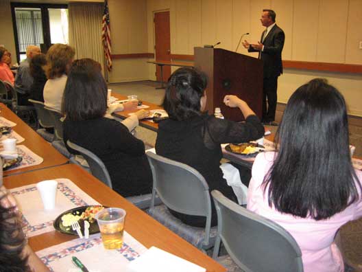
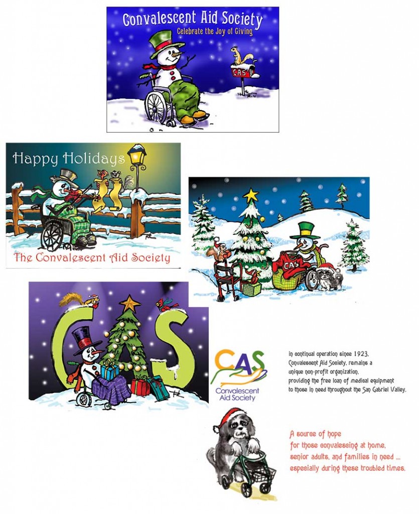
To connect with the medical community, we held a medical equipment donation drive. and we arranged speaking engagements for the CEO. At that time, Youtube was still coming of age, but early on we made video commercials that ran on the website and on local cable stations. Christmas season was our biggest fund raising for our newsletter so we designed unique Christmas cards where we had a snowman mascot in a wheelchair that our donors were eager to receive in December.

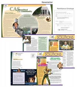
Here are some of the materials we designed.

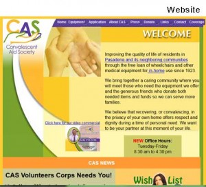
Website
Website
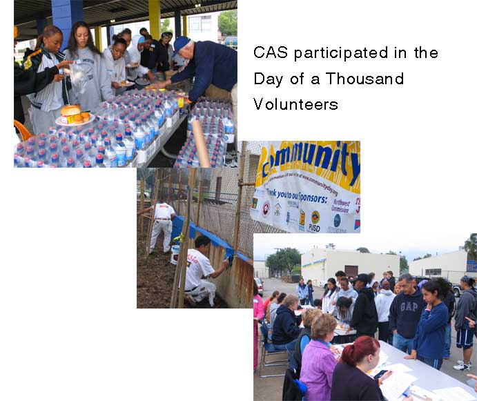
WYNK increased its visibility in the community
newsletterfullpageflyer
quarterpageradioAd
TRUCKmag-ad
banner-adnewspaperad
conferencesourena
CAS CEO speaking at the St. Joseph Medical Hospital Breakfast Meeting.

communitywalls

xmascards