Corporate Branding for CAS

Corporate Branding begins with a lot of listening. It is understanding the client’s service, its goals, its personality and balancing all of these ideas with the budget at hand. WYNK’s favorite clients are non-profit organizations because they are all about making the world a better place.

ned

Convalescent Aid Society Logo

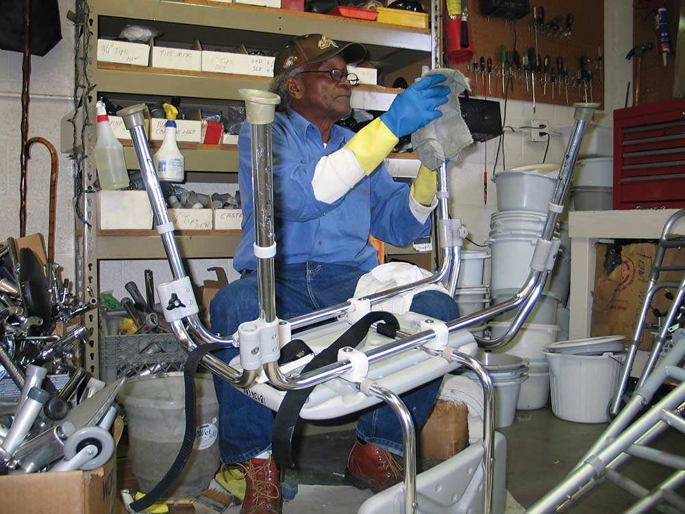
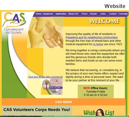
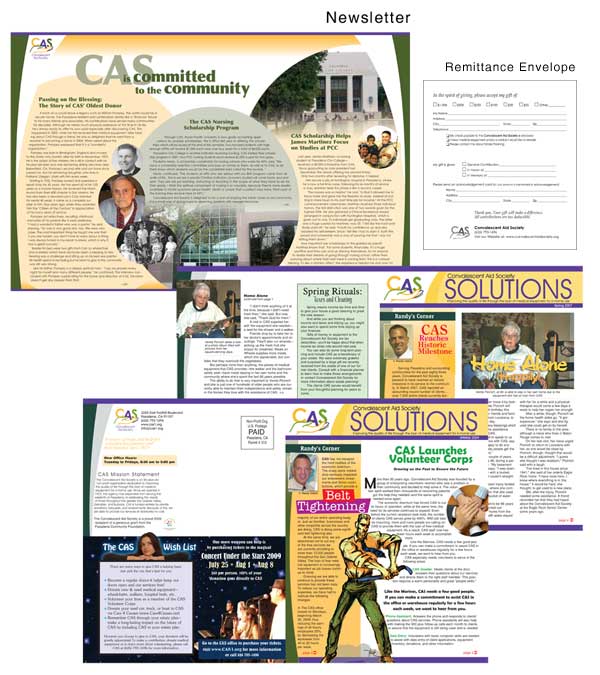
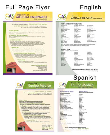
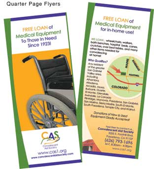
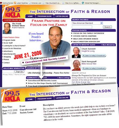
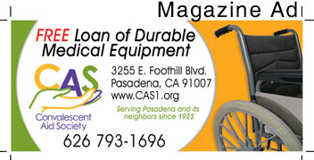
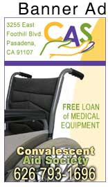
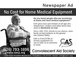
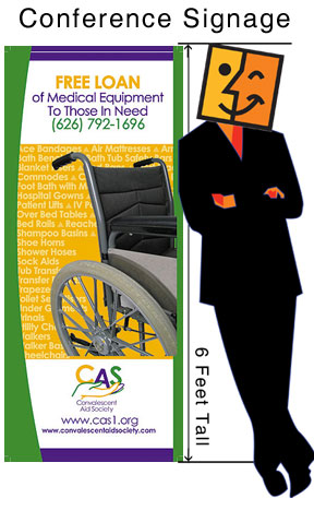
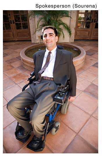
The Convalescent Aid Society is an admirable non-profit located in the Pasadena area. They lend out durable medical equipment to anyone in need. WYNK overhauled the corporate look from the logo, the website, the marketing materials down to the utility van. We also collaborated with churches and other non-profits to help build awareness and to generate donations. We wrote press releases, designed magazine ads, newspaper ads, banner ads, convention signage. We arranged with a quadriplegic (Sourena Vassenghi) to become a spokesperson.

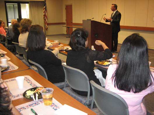
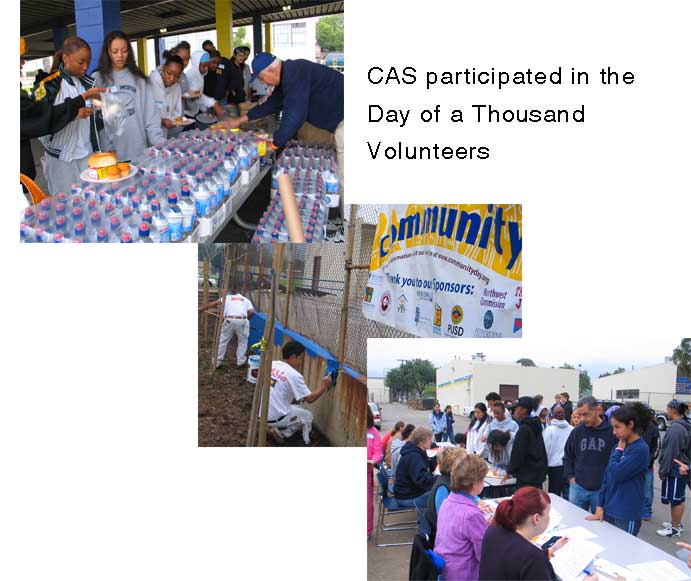
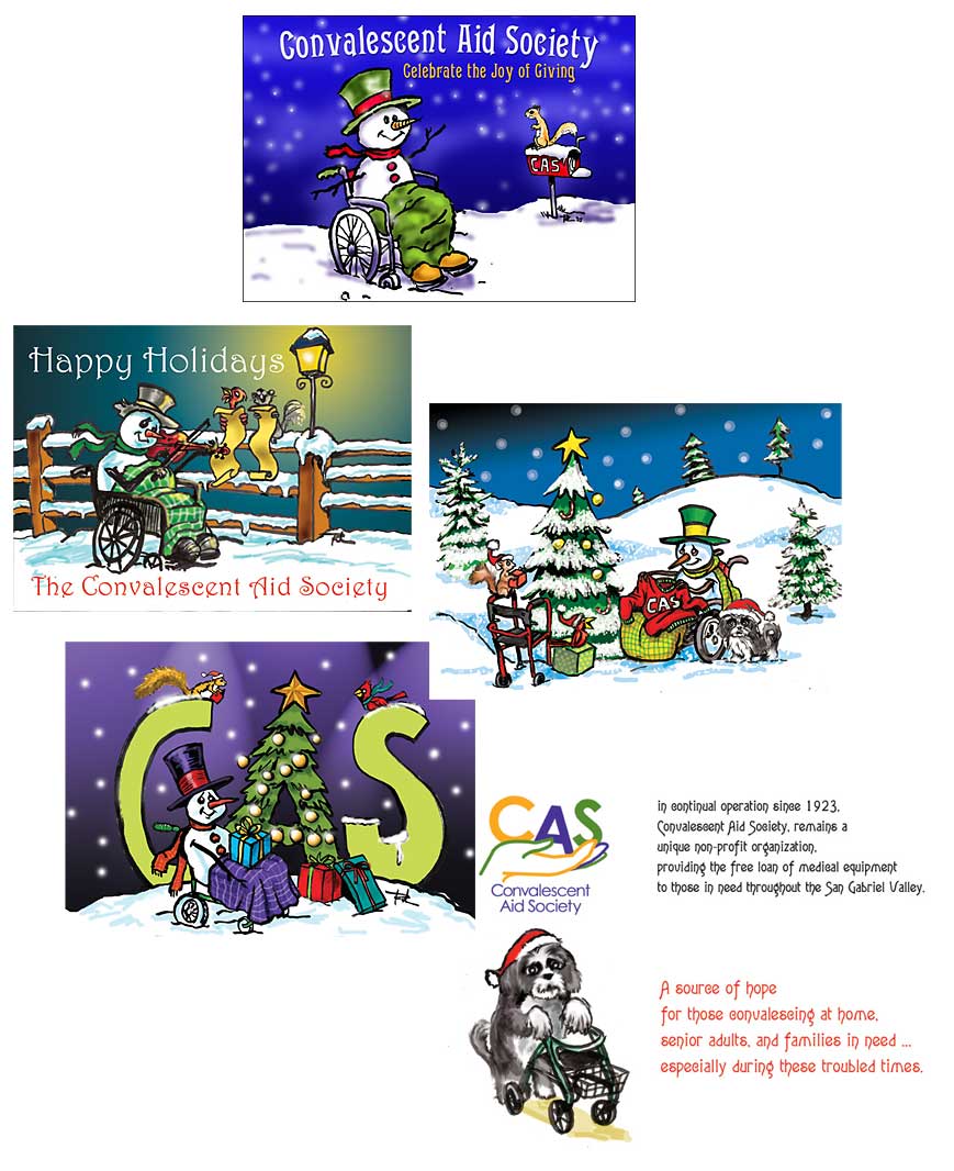
To connect with the medical community, we held a medical equipment donation drive. and we arranged speaking engagements for the CEO. At that time, Youtube was still coming of age, but early on we made video commercials that ran on the website and on local cable stations. Christmas season was our biggest fund raising for our newsletter so we designed unique Christmas cards where we had a snowman mascot in a wheelchair that our donors were eager to receive in December.

Here are some of the materials we designed.

Website
Website
WYNK increased its visibility in the community
newsletterfullpageflyer
quarterpageradioAd
TRUCKmag-ad
banner-adnewspaperad
conferencesourena
CAS CEO speaking at the St. Joseph Medical Hospital Breakfast Meeting.

communitywalls

xmascards

Fashion Illustration Project

We were commissioned by a designer of a fashion website to create illustrations for an upcoming campaign. They said they wanted something petite, hip, colorful, trendy and fun. Although we had never done fashion drawings before, we were confident we could pull this off . This was very different from what we had previously done so we had to study the fashion trends coming out of the malls — from the signage, to the mannequins and to the clothes themselves.

We noticed that there was always movement — a visual direction that the eye is led to follow. Of course there was also color — either in subtle dainty hues or bold and daring —- making a statement. Fashion drawings were also minimalist — not a lot of detail … except maybe in the pattern in the garments.  After a few days of initial sketches, we sent them to the client and that led to more finished renderings. Admittedly, this may be a rather simplistic view of fashion illustration but apparently it registered correctly with the client. We submitted the final work and, needless to say, the client was very pleased with the few designs we came up with.

Here are some of the sketches we made. Enjoy.

wine2wine4

wine-color3

walkdog2walkingwalking-colored

walkdogwalkdogcasualwalkdog-water2red-wine

reading3reading2

reader2

reading2reader-colored2reader

nailpolishreader3

jewelrycleaner5

cleaner2cleaner-color

cleaner4cleaner3cleaner