Chalk Art for the City of La Habra

La Habra held its first ever Art Walk on July 18, 2015. As usual I opened my big mouth and volunteered to help. I said I had never made one of those 3D Chalk Drawings that you see in the internet but if they were interested, I could probably create one. David DeLeon of Community Planning was delighted. In my mind I started calculating the work preparation — the designing, the measuring, the execution and  realized this was going to take at least half a day. So I tried to back pedal and reiterated that I had never done that before. But it was obvious David was already sold to the idea. My goose was cooked.

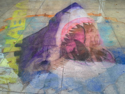
As the day approached I thought it was going to be cancelled because I had not heard anything more about it. Then Michelle Bernier of the La Habra Business Connection called about a week before D-Day and asked me what materials I needed. Never having done this before I said “colored chalk — lots of it.” And that was it. I hurriedly designed a great white shark coming out of a crack in the pavement. I coordinated with Luz Sparks of La Habra Art Gallery and she met with me Friday afternoon and checked out the site. After deciding where the shadows were going to fall at the time of the event, I started measuring the pavement and made the initial outlines. The sun was shining in full glory so I figured I was going to get burned doing this the next day.

Saturday morning, the day of the event, I started the work. Curious passersby looked at it approvingly. I felt I was on the right track. Looking at the limited colors available, I had to adjust to what was in the original design.  Anyway, about 3 hours into the drawing, I saw tiny raindrops splatter on the design. I looked up and saw ominous clouds laughing at me — daring me to continue. I’m an optimist (a stupid one at that) and continued — “surely Mother Nature wouldn’t ruin the fun for all the kids and families, right?” Well, I was wrong. Within a few minutes it started to pour … and pour … and pour.

Here is what I did before the rain:
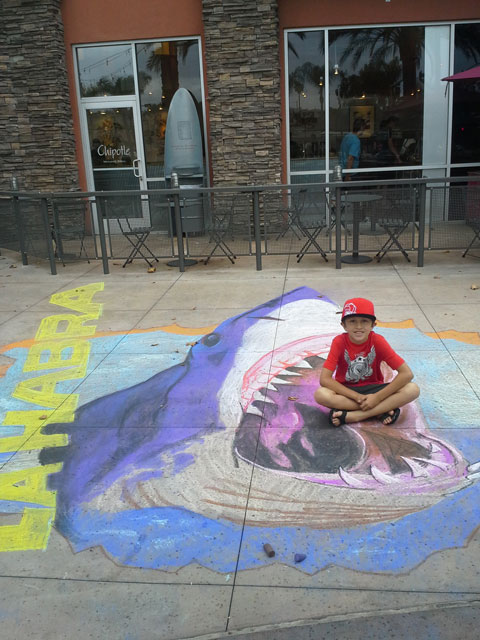
Jaws in La Habra
Jaws in La Habra


And here is what happened during the rain.

Washed away

Washed away


Oh well, at least one kid was able to take a souvenir of the very first Art Walk in La Habra — that never was.

If you want to read more about this, I posted this on 2 websites:

Gone in a Flash

There is a sad trend in websites. Thanks to some security flaws, Flash Animation is slowly disappearing. Well … that and a few more reasons.

Article on Flash Attacks
If you are in still in the woods and don’t know what I’m talking about, here’s a sample Flash animation from the Traveling Boy Website which was developed by WYNK.

Other reasons for the dying flash animation would include:

  • longer download time (because of the size) – although this is getting less of an issue since the bandwidth speeds are getting better and better.
  • Some people just want the data and prefer not to have to go through a video to get it.
  • Some don’t have the patience for anything.

You will notice that major websites like Nike or Mercedes Benz that used to be heavy with Flash animation have now opted for Javascript slide presentations (so far Javascript slides are still safe). They’re not as dramatic and flexible as flash but until the problem is fixed, this seems to be the animation of choice.

Here’s a sample of a slide presentation WYNK made for TravelingBoy.com using Javascript.

And since I am in the topic about security on the web, if you are still using Microsoft Explorer, please save yourself some headache — switch to Firefox or Chrome (there are other browsers but these are my 2 favorites). Microsoft has already said they will no longer be in the web browser business. And if you are one of the dinosaurs still using Windows XP, go ahead and use it but just realize that if your browser crashes … worse — if your computer crashes, no one (except maybe Bubba, your friendly neighborhood tech guy)  will be available to help you.  And if you are taking the risk, just be sure to backup your data.
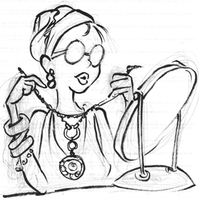
I don’t know if I’ll miss Flash when it comes to advertisements. But I will miss it in some websites. I hope they come up with a remedy soon. I always like to have options available.
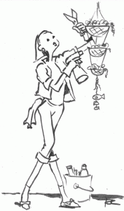
It’s a changing world out there but there will always be good guys and bad buys.

Corporate Branding for CAS

Corporate Branding begins with a lot of listening. It is understanding the client’s service, its goals, its personality and balancing all of these ideas with the budget at hand. WYNK’s favorite clients are non-profit organizations because they are all about making the world a better place.

ned

Convalescent Aid Society Logo

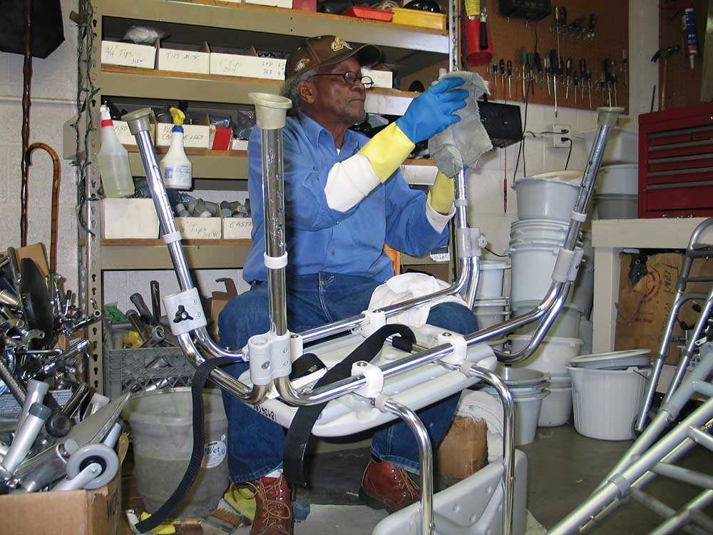
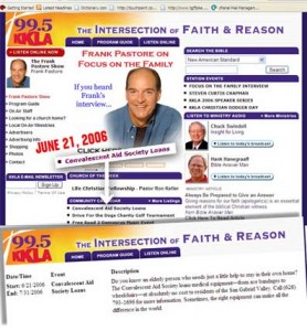
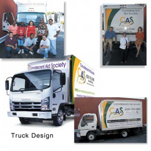
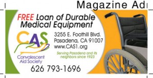
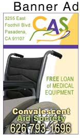
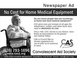
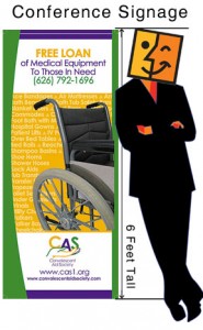
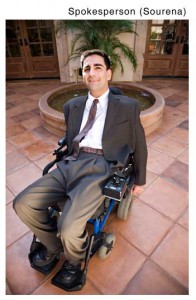
The Convalescent Aid Society is an admirable non-profit located in the Pasadena area. They lend out durable medical equipment to anyone in need. WYNK overhauled the corporate look from the logo, the website, the marketing materials down to the utility van. We also collaborated with churches and other non-profits to help build awareness and to generate donations. We wrote press releases, designed magazine ads, newspaper ads, banner ads, convention signage. We arranged with a quadriplegic (Sourena Vassenghi) to become a spokesperson.

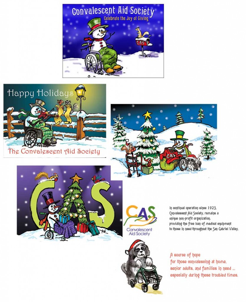
To connect with the medical community, we held a medical equipment donation drive. and we arranged speaking engagements for the CEO. At that time, Youtube was still coming of age, but early on we made video commercials that ran on the website and on local cable stations. Christmas season was our biggest fund raising for our newsletter so we designed unique Christmas cards where we had a snowman mascot in a wheelchair that our donors were eager to receive in December.

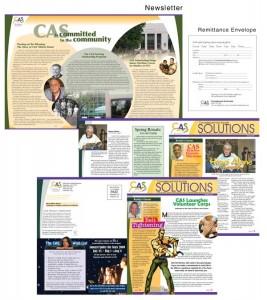
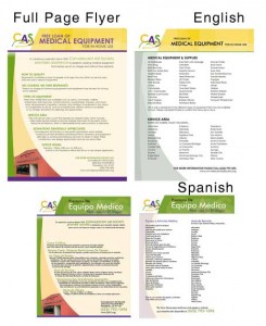
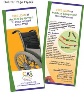
Here are some of the materials we designed.

Website
Website
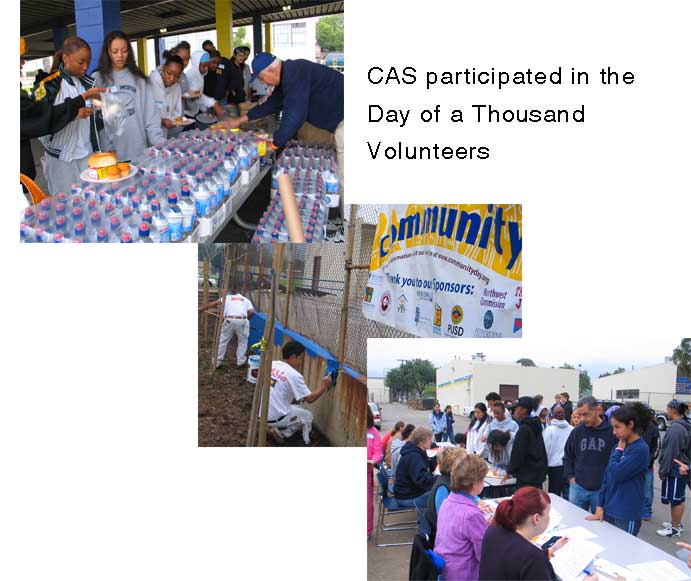
WYNK increased its visibility in the community
newsletterfullpageflyer
quarterpageradioAd
TRUCKmag-ad
banner-adnewspaperad
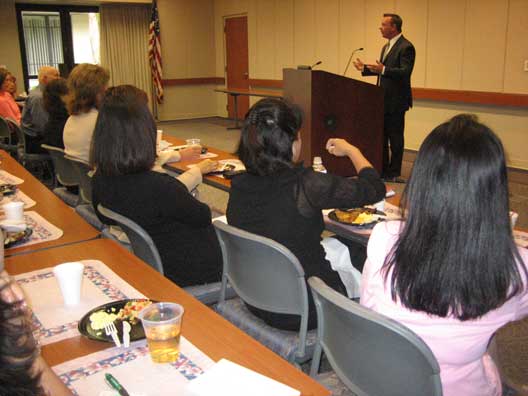
conferencesourena
CAS CEO speaking at the St. Joseph Medical Hospital Breakfast Meeting.

communitywalls

xmascards

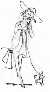
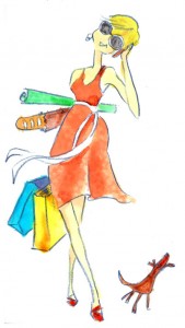
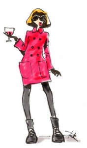
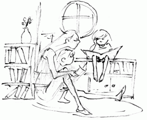
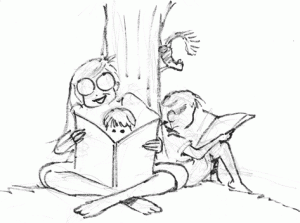
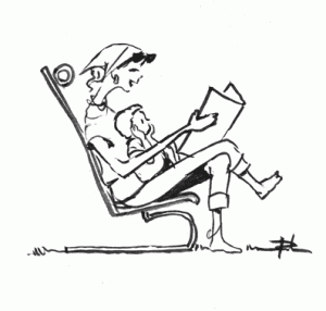
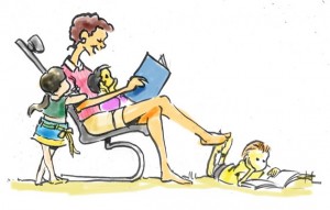
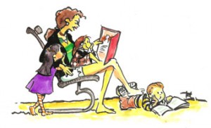
Fashion Illustration Project

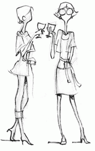
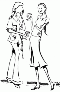
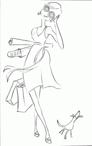
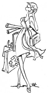
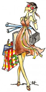
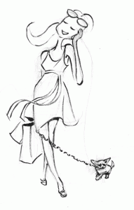
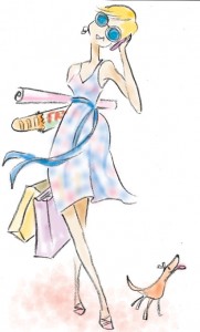
We were commissioned by a designer of a fashion website to create illustrations for an upcoming campaign. They said they wanted something petite, hip, colorful, trendy and fun. Although we had never done fashion drawings before, we were confident we could pull this off . This was very different from what we had previously done so we had to study the fashion trends coming out of the malls — from the signage, to the mannequins and to the clothes themselves.

We noticed that there was always movement — a visual direction that the eye is led to follow. Of course there was also color — either in subtle dainty hues or bold and daring —- making a statement. Fashion drawings were also minimalist — not a lot of detail … except maybe in the pattern in the garments.  After a few days of initial sketches, we sent them to the client and that led to more finished renderings. Admittedly, this may be a rather simplistic view of fashion illustration but apparently it registered correctly with the client. We submitted the final work and, needless to say, the client was very pleased with the few designs we came up with.

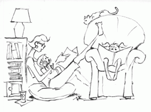
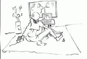
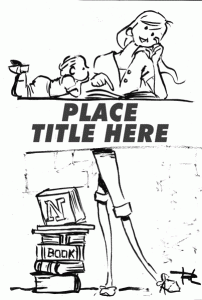
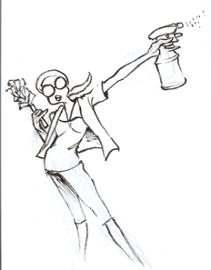
Here are some of the sketches we made. Enjoy.

wine2wine4

wine-color3

walkdog2walkingwalking-colored

walkdogwalkdogcasualwalkdog-water2red-wine

reading3reading2

reader2

reading2reader-colored2reader

nailpolishreader3

jewelrycleaner5

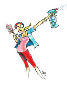
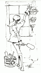
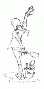
cleaner2cleaner-color

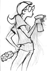
cleaner4cleaner3cleaner