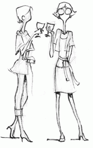
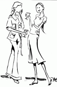
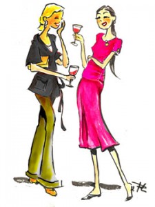
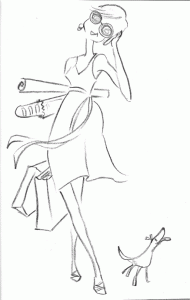
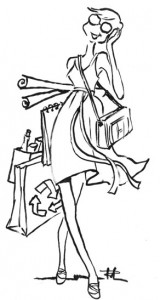
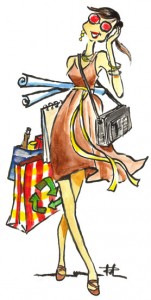
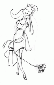
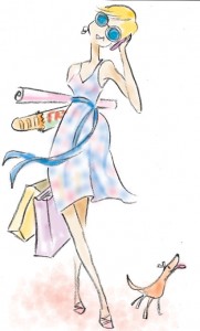
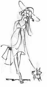
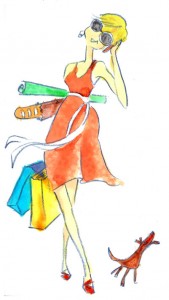
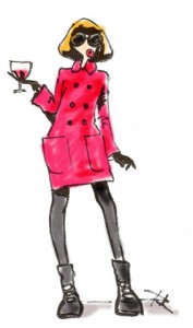
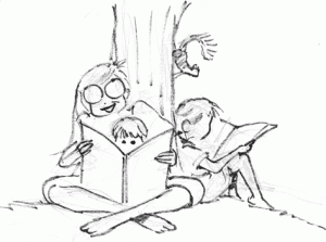
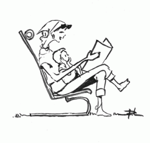
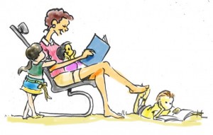
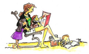
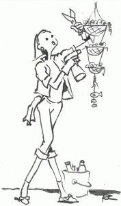
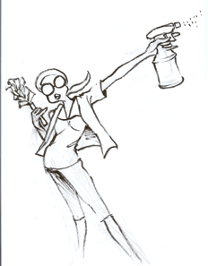
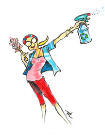
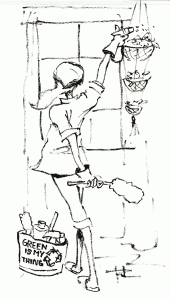
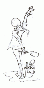
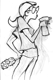
We were commissioned by a designer of a fashion website to create illustrations for an upcoming campaign. They said they wanted something petite, hip, colorful, trendy and fun. Although we had never done fashion drawings before, we were confident we could pull this off . This was very different from what we had previously done so we had to study the fashion trends coming out of the malls — from the signage, to the mannequins and to the clothes themselves.
We noticed that there was always movement — a visual direction that the eye is led to follow. Of course there was also color — either in subtle dainty hues or bold and daring —- making a statement. Fashion drawings were also minimalist — not a lot of detail … except maybe in the pattern in the garments. After a few days of initial sketches, we sent them to the client and that led to more finished renderings. Admittedly, this may be a rather simplistic view of fashion illustration but apparently it registered correctly with the client. We submitted the final work and, needless to say, the client was very pleased with the few designs we came up with.
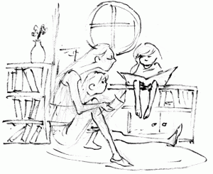
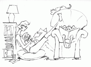
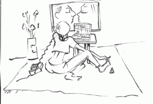
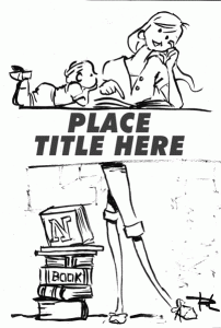
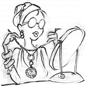
Here are some of the sketches we made. Enjoy.
